What broke when I put my website in Khmer
On this page
This site is in English, Khmer and Spanish, the three languages I speak.
English and Spanish worked with every tool I tried. Khmer broke something at almost every step: the reading time, the fonts, the link preview images and the resume PDF. I built the site the way I build most things now, with an AI agent writing most of the code and me reviewing it. The agent hit every one of these walls too.
Here’s each thing that broke, why, and how I fixed it. You don’t need to read Khmer to follow along. If you’re building anything in Khmer, most of it will apply to you.
A quick look at Khmer
Three things about how Khmer is written cause nearly all of the trouble:
- No spaces between words. Khmer only puts a space between phrases, about where English would put a comma.
- Letters stack. A consonant can sit under another one, and vowels can go above, below, before or after their consonant.
- Some letters are typed after the letter they’re drawn in front of.
The third one is easiest to see. Type this word one key at a time and watch the third key:
Most software treats text as a row of letters, one after the other. Khmer breaks that idea in all three ways.
Reading time: Khmer has no spaces
Each article shows how long it takes to read. To work that out, you count the words and divide by about 220 a minute. The usual way to count words is to split the text wherever there’s a space. In Khmer that finds phrases, not words. Try it on the first sentence of the Khmer version of my pull request review article:
Splitting on spaces finds 4 words. JavaScript has a tool that knows where Khmer words start and end, called Intl.Segmenter, and it finds 13. Here are both in code:
const text = 'ខ្ញុំលែងអានកូដគ្រប់បន្ទាត់ មុនពេលវាត្រូវបាន merge ទៀតហើយ។';

text.split(' ').length; // 4

const words = new Intl.Segmenter('km', { granularity: 'word' }).segment(text);
[...words].filter((w) => w.isWordLike).length; // 13
Over a whole article the gap adds up. Counting spaces, my Green Tests article would say 3 minutes in Khmer and 9 in English. Counting words, it’s 11.
Intl.Segmenter is built into browsers, Node and Bun. It finds Khmer words with a word list, so it’s a very good guess rather than a perfect one, which is plenty for a reading time. The site counts once, when it builds the pages:
function countWords(text: string, lang: Lang): number {
  let n = 0;
  for (const part of new Intl.Segmenter(lang, { granularity: 'word' }).segment(
    text,
  )) {
    if (part.isWordLike) n++;
  }
  return n;
}
isWordLike leaves out the spaces and punctuation, so only words count. English and Spanish go through the same code and come out the same as before.
Fonts and line height
The site uses Google Sans for both Latin and Khmer letters. It comes as two files, one with the Latin letters and one with the Khmer ones, and each file says which letters it has. Getting the letters on screen was the easy part. Making room for them took longer.
Khmer inside code
Even this article broke while I was writing it. Code blocks use a different font, Google Sans Code, and it has no Khmer letters at all. When a font is missing a letter, the browser borrows it from another font on your computer.
Most phones and laptops have a Khmer font to borrow from, so it works, but it doesn’t match the rest of the page. The computer that took my screenshots had none, so it borrowed from Unifont, which draws every Khmer letter on its own without stacking or moving any of them:
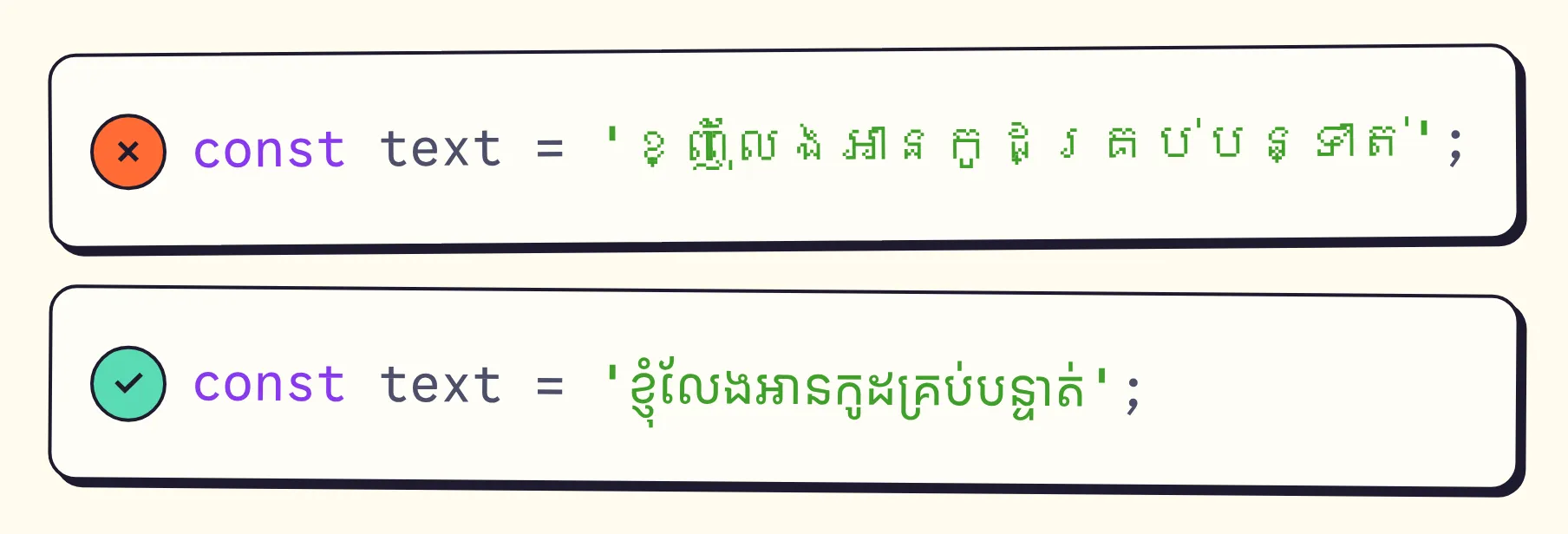
Top: Khmer borrowed from Unifont. Bottom: the site’s own Khmer font.
The fix was to give the code font a second file: the same Khmer file the rest of the page already uses. In the site’s font settings, the code font now lists two files, and the second one is only for Khmer letters:
{
  name: 'Google Sans Code',
  // ...
  options: {
    variants: [
      {
        src: ['./src/assets/fonts/google-sans-code-latin.woff2'],
        unicodeRange: latinRange,
      },
      // Google Sans Code has no Khmer, so Khmer in code uses the same Khmer
      // file as the rest of the site.
      {
        src: ['./src/assets/fonts/google-sans-khmer.woff2'],
        unicodeRange: khmerRange,
      },
    ],
  },
},
unicodeRange is the list of letters each file covers. The browser already has the Khmer file for the rest of the page, so it doesn’t download it again.
Taller lines
Khmer stacks letters above and below the line, so it needs more space between lines than English does. With too little, the bottom of one line runs into the top of the next:
ហើយផឹកទឹកក្រូចឆ្មារ
ហើយផឹកទឹកក្រូចឆ្មារ
So Khmer text gets a line height of 1.8:
[lang='km'] {
  line-height: 1.8;
}

/* Khmer headings in an article take two notebook rules a line. */
.prose :where(h2:lang(km)) {
  line-height: calc(var(--rule-gap) * 2);
}
The second rule is for the notebook paper behind this text. Every line of text sits on one of its rules, and the rules are 32 pixels apart. An English heading fits on one rule. A Khmer heading needs two.
No fake italics
Google Sans has no slanted Khmer letters. When a page asks for italics anyway, the browser tilts the upright ones, and stacked letters don’t look good tilted:
So in Khmer, the captions under pictures stay upright in a lighter ink, and emphasis inside a sentence is bold.
Link previews: drawing Khmer without a browser
When someone shares a page on LinkedIn, Telegram or WhatsApp, the app shows a preview image. The site draws one for every page in each language when it builds.
What went wrong
Remember the word you typed at the top: the third key was drawn first, on the left. Working out things like that, which letters stack and where each piece goes, is called shaping. A browser shapes text for you. When the site builds, there’s no browser, and the first version left the text to resvg, a library that turns an SVG picture into a PNG. It doesn’t shape Khmer:
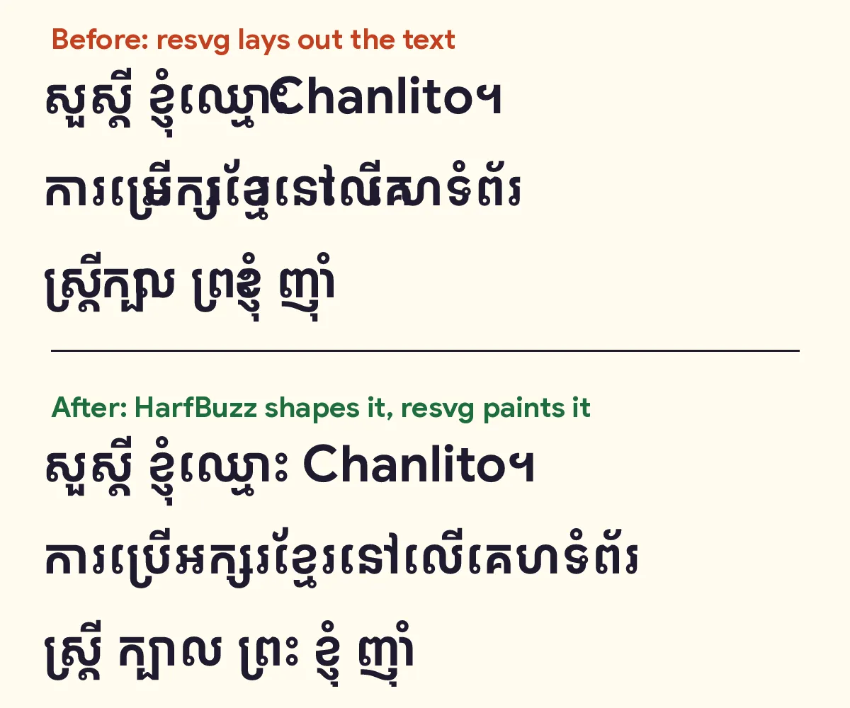
Same text, same font. The difference is who shapes it.
Letters went missing, stacked letters landed in the wrong places, and ឈ្មោះ (“name”) ran straight into Chanlito.
Shape first, then paint
Browsers shape text with a library called HarfBuzz. Chrome, Firefox and Android all use it. So now the site does too. HarfBuzz works out the shape and place of every letter, each shape becomes an outline, and resvg only paints the outlines. It never has to understand a letter:
function shape(text: string, size: number): Shaped {
  const scale = size / face.upem;
  const glyphs: { path: string; x: number; y: number }[] = [];
  let pen = 0;
  for (const run of runs(text)) {
    const buffer = new hb.Buffer();
    buffer.addText(run.text);
    buffer.guessSegmentProperties();
    if (run.khmer) {
      buffer.setScript('Khmr');
      buffer.setLanguage('km');
    }
    hb.shape(font, buffer);
    for (const g of buffer.getGlyphInfosAndPositions()) {
      const path = font.glyphToPath(g.codepoint);
      if (path) {
        glyphs.push({
          path,
          x: (pen + (g.xOffset ?? 0)) * scale,
          y: -(g.yOffset ?? 0) * scale,
        });
      }
      pen += g.xAdvance ?? 0;
    }
  }
  // ...
}
The highlighted lines are the important part: tell HarfBuzz the text is Khmer, shape it, then turn each letter’s shape into an outline. A title like “ខ្ញុំឈ្មោះ Chanlito” is split first, so the Khmer gets Khmer rules and “Chanlito” gets Latin ones. The images now come out the way Chrome would draw them, at about 35 KB each, small enough for WhatsApp.
The resume PDF: text that copies back right
The site also builds my resume as a PDF in each language. A PDF has to look right, and its text has to come back out right when someone copies or searches it. Hiring tools read that text, not the picture.
I tried three tools. Chrome’s print to PDF drew Khmer correctly, but the site builds on Cloudflare, which has no Chrome to print with. pdfkit, a popular JavaScript library, drew it correctly too, but it saved the letters in the order they’re drawn instead of the order they’re typed. So copy ប្រព័ន្ធ out of the PDF and the tucked letter comes out first:
Typst, a typesetting tool, shapes text with a version of HarfBuzz and saves the letters in the order they were typed, so copying and searching both work. Each PDF takes 30 to 90 milliseconds to build. Here’s the part of the resume template that sets up Khmer:
// Khmer stacks marks above and below its letters, so it needs taller lines
// (as on the site) and a slightly smaller size to stay on one page.
#let pick(latin, khmer) = if km { khmer } else { latin }

#set text(
  font: ("Resume Sans Latin", "Resume Sans Khmer"),
  size: pick(9.4pt, 8.7pt),
  lang: data.lang,
)
#set par(leading: pick(0.62em, 0.86em))
pick chooses the Latin or the Khmer value, so Khmer gets a slightly smaller size and taller lines, and the resume still fits on one page.
What I’d tell anyone building in Khmer
Most of the fixes were small. Finding them was the hard part, and you only find them if you look at real Khmer on a real screen. What I’d do from day one:
- Test with hard words, not just សួស្តី (“hello”). Use words that stack and reorder, like ស្ត្រី, ប្រព័ន្ធ and ញ៉ាំ.
- Count words with
Intl.Segmenter, never by splitting on spaces. - Give Khmer taller lines than Latin, and check headings on a phone, where they wrap.
- Anywhere a browser isn’t drawing your text, like images and PDFs, make sure HarfBuzz or something built on it is doing the shaping.
- Copy your text back out of whatever you generate, and compare it with what went in.
Thai, Lao and Burmese don’t put spaces between words either, so a lot of this applies to them too. If you build software in one of these languages, what broke for you?
0likes
thank you!